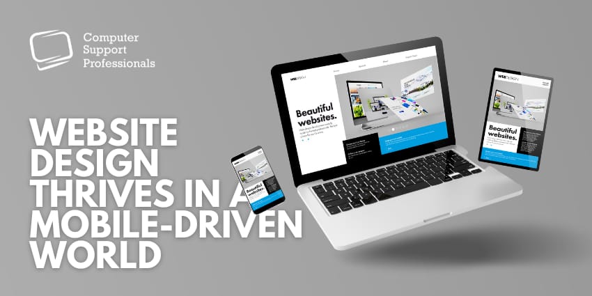
Mobile devices have become an integral part of our lives. With the majority of internet traffic originating from smartphones and tablets, ensuring your business website is mobile-friendly has never been more critical. This article explores the importance of mobile-friendly website design, the benefits of custom web development, and the critical role of a compelling call to action to ensure your business website thrives in this mobile-driven world.
The Significance of Mobile-Friendly Website Design
The first step in adapting to the mobile-driven world is to create a responsive website that can adjust to various screen sizes, providing an optimal user experience across all devices. Here are some key reasons why mobile-friendly design is essential:
Improved User Experience
A mobile-friendly website ensures that users have a seamless and enjoyable experience when accessing your content from their smartphones or tablets. The design is responsive, meaning it adapts to different screen sizes and orientations, making it easy for visitors to navigate, read, and interact with your site. This enhanced user experience can lead to longer visit durations, reduced bounce rates, and increased engagement.
Higher Search Engine Rankings
Search engines, especially Google, prioritize mobile-friendly websites in their search results. Google’s mobile-first indexing means that it predominantly uses the mobile version of a site’s content for ranking and indexing. If your website isn’t mobile-friendly, it may be penalized in search rankings, resulting in lower visibility and reduced organic traffic. A mobile-friendly design is a fundamental element of search engine optimization (SEO).
Wider Audience Reach
With the majority of internet traffic coming from mobile devices, a mobile-friendly website broadens your reach. It accommodates a diverse audience who may be accessing your site through various smartphones, tablets, or even smartwatches. By catering to these users, you increase your chances of attracting and retaining a more extensive and diverse audience.
Faster Page Loading
Mobile-friendly design often leads to faster page loading times. Slow-loading websites can frustrate users, causing them to abandon your site. A responsive design that’s optimized for mobile devices reduces the time it takes for pages to load, improving user satisfaction and retention.
Reduced Bounce Rates
A website that isn’t mobile-friendly can result in high bounce rates, where visitors quickly leave your site because of a poor user experience. Mobile users are typically on the go and have less patience for usability issues. A mobile-friendly design keeps visitors engaged and encourages them to explore your content further.
Custom Web Development for Tailored Solutions
While mobile-friendly design is crucial, a custom web development approach takes your website to the next level. Custom web development involves creating a business website from scratch or modifying an existing one to meet your specific needs. Here’s why custom development is beneficial:
Tailored Functionality: A custom website can be designed to include unique features and functionalities that cater to your business’s unique requirements.
Enhanced Security: Custom development allows for robust security measures to be implemented, protecting your site from potential threats and vulnerabilities.
Optimized Performance: Custom websites can be fine-tuned for speed and performance, ensuring fast load times and a seamless user experience.
Scalability: Your business website can grow with time. Custom development provides the flexibility to add new features and expand your online presence as needed.
The Power of a Compelling Call to Action (CTA)
To encourage user engagement and conversions on your mobile-friendly, custom-designed website, an effective Call to Action (CTA) is essential. A CTA prompts visitors to take a specific action, such as making a purchase, signing up for a newsletter, or contacting your business. Here’s how CTAs can boost your website’s performance:
Guided User Journey: A well-placed CTA guides visitors toward a desired action, ensuring they don’t leave your website without taking the next step.
Increased Conversions: CTAs serve as the final push for users to convert into customers, helping you achieve your business goals.
Clear Communication: A compelling CTA communicates your value proposition and the benefits of taking the desired action.
A/B Testing Opportunities: You can experiment with different CTAs to determine which ones are the most effective at driving conversions.
Summary
In conclusion, to ensure your business website thrives in a mobile-driven world, it’s crucial to embrace mobile-friendly design and consider custom web development for tailored solutions. Additionally, don’t underestimate the power of a compelling Call to Action (CTA) in driving user engagement and conversions.
As technology continues to evolve, having the support of Computer Support Professionals can be invaluable in ensuring your website remains up-to-date, secure, and optimized for the ever-growing mobile audience. So, invest in these critical elements and stay ahead in the digital landscape.
Also Read:


